


About the Project
ABDR Studio is a leading Italian architecture firm known for its public and cultural infrastructure projects, including the Florence Opera House and Rome’s Tiburtina Station.
I was asked to redesign their presentation boards across different formats. So I created a system to help the team produce clear, functional, and visually appealing presentations, while ensuring consistency between physical and digital outputs.
The challenge was to design templates that not only supported the creation of presentations, but also aesthetically improve the design of the tables without compromising the richness of their content. The final system was delivered as a set of ready-to-use InDesign file templates, allowing the studio to work independently with ease.
Services
Graphic Design
Strategy
Editorial Design


Design Process
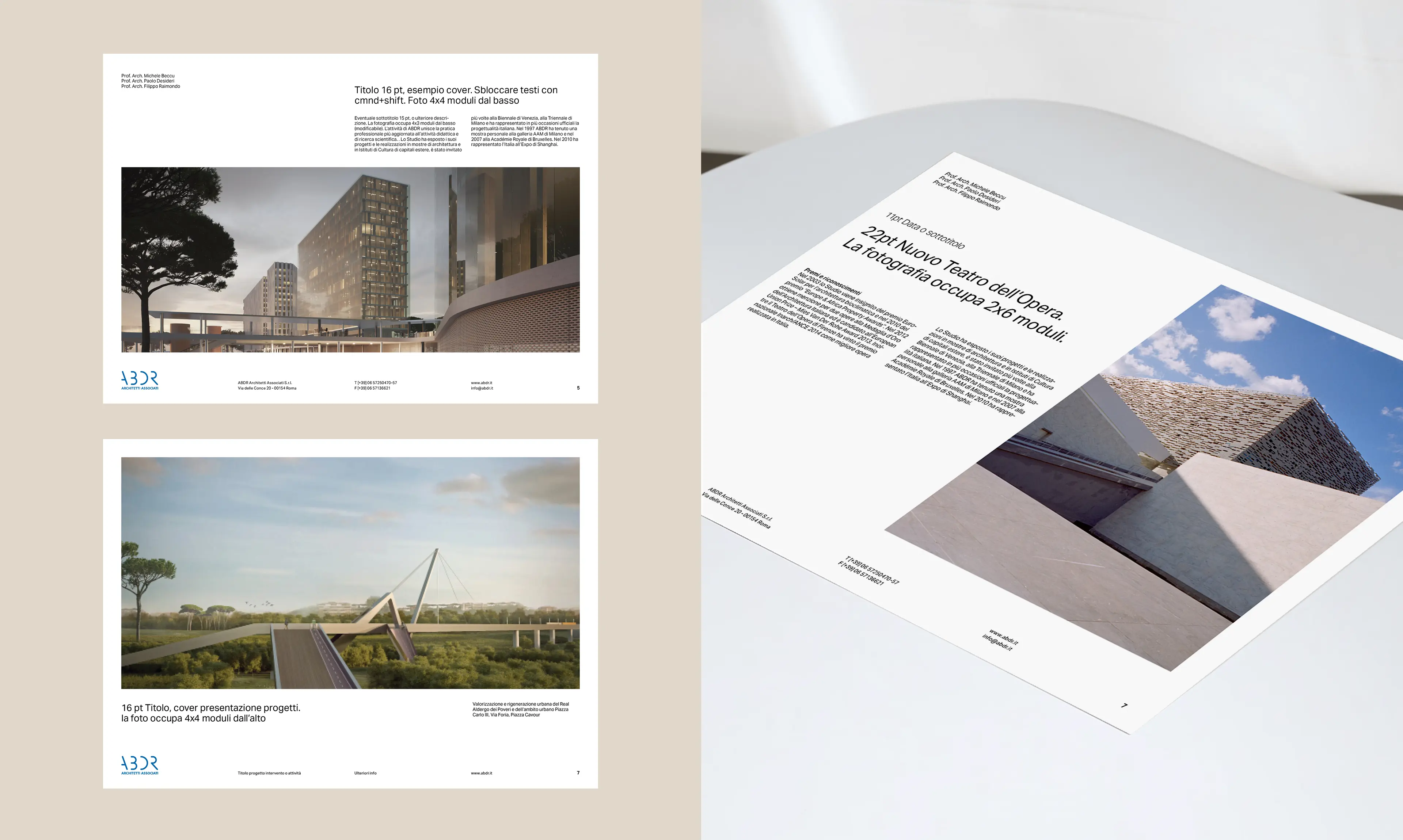
The grid system is built on layout modules that define the organisation of text, images, and graphic elements, making compositions feel balanced, readable, and coherent, while still flexible enough to accommodate different types of content.
Since the studio was using several fonts inconsistently, I introduced Aktiv Grotesk a modern sans serif with refined curves and sharp edges that echo the language of architecture. Starting with the A3 format, I defined the placement and size of the ABDR logotype, set margins, columns structure, and grid gutters, and then established the baseline grid.


Visual language & personality
I established a 12pt baseline grid, parallel horizontal that align text and other elements across the page, matched to the line spacing of the body text. This ensured all text elements sit in visual harmony. From there, I built a 6×6 modular grid, with each module based on eight baseline lines, a system flexible enough to support multiple layout variations while maintaining consistency across pages.
To guide composition, I defined clear rules for the placement of text and images, giving room for white space and lightening the overall structure. For example, one-third of the layout (2×6 modules) is reserved for titles and paragraphs, placed across two columns. The result is a clear, versatile system that supports complex content without feeling heavy.
The difference is visible, what was once dense and chaotic now feels structured and balanced. A before/after video inside the project shows exactly how far the system takes the original layouts.

All Works


