


About the Project
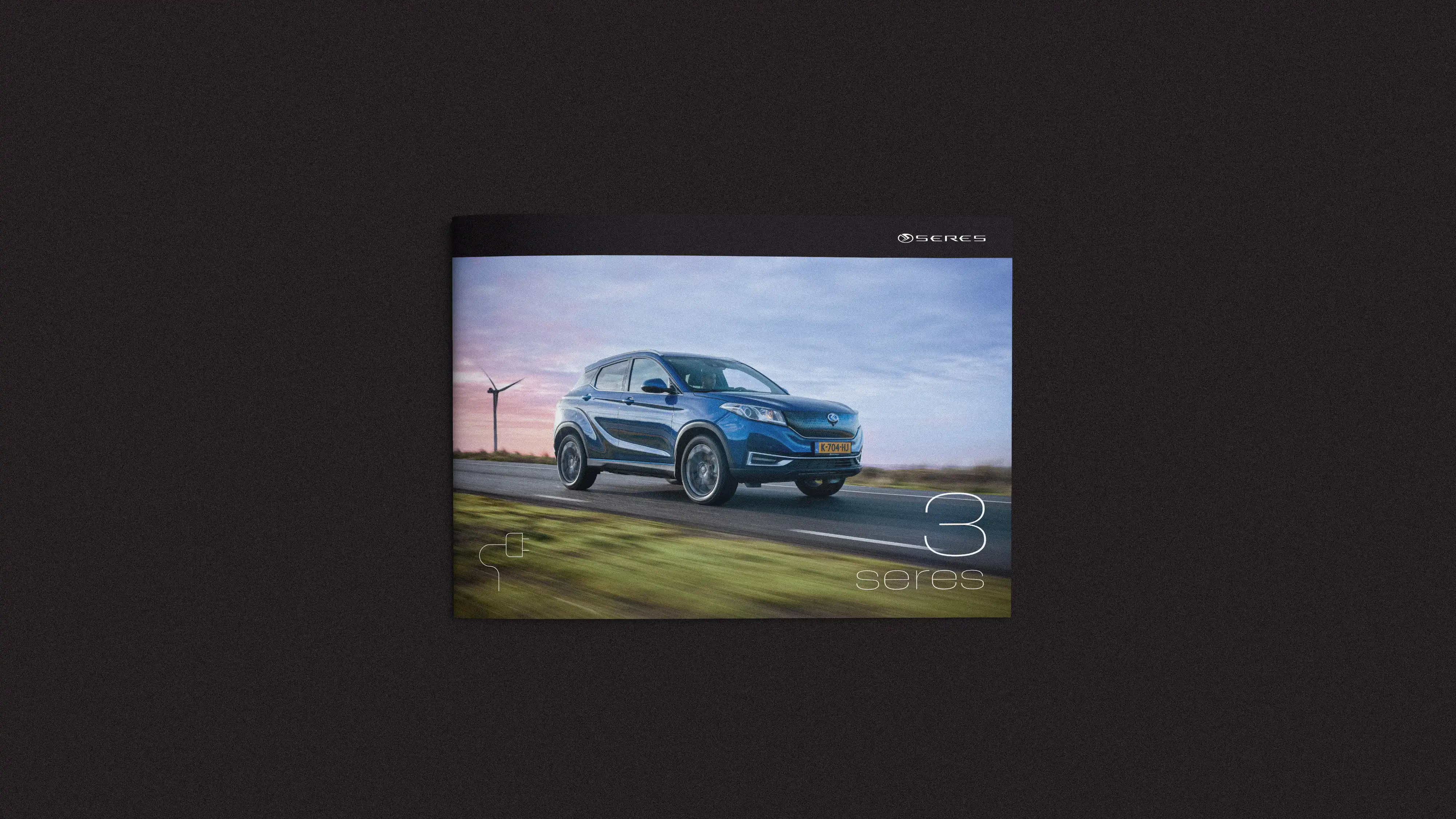
Seres is a Chinese electric vehicle brand known for its smart technology, clean design, and forward-thinking approach. As the Seres 3, their compact electric SUV, entered the Dutch market, they needed a visual identity that reflected the car’s modern, premium character and supported a strong commercial debut.
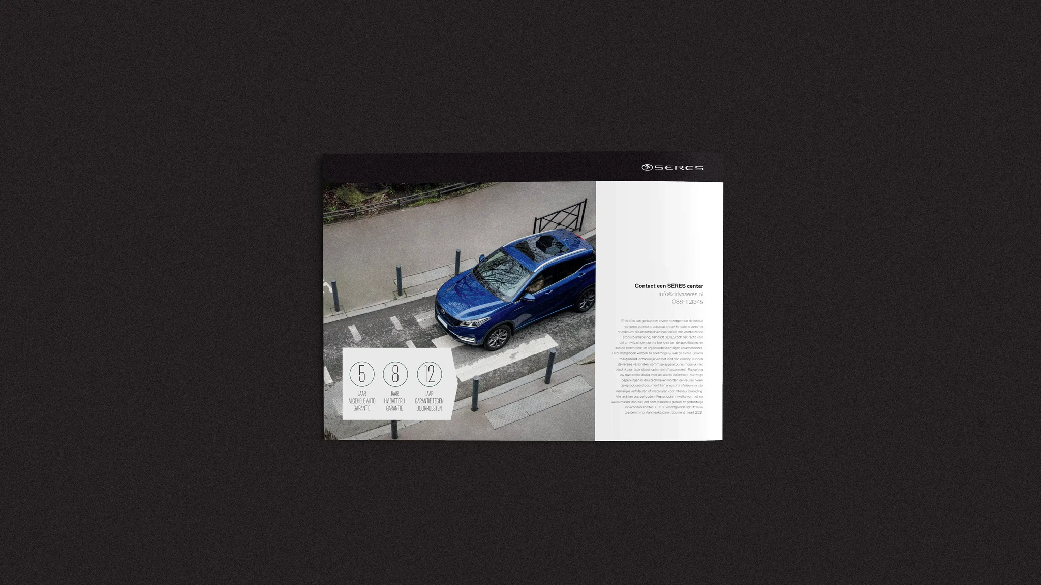
At Home of the Brave , I contributed to defining a new visual system: a bold and recognisable typographic style, a clean colour palette, an icon set, and clear layout rules. We then applied this system across both print and digital touchpoints, designing a brochure and a landing page for Seres 3. The result is a cohesive, contemporary brand experience that mirrors the car’s personality.
Services
Visual Idenity
Strategy
Webdesign


Design Process
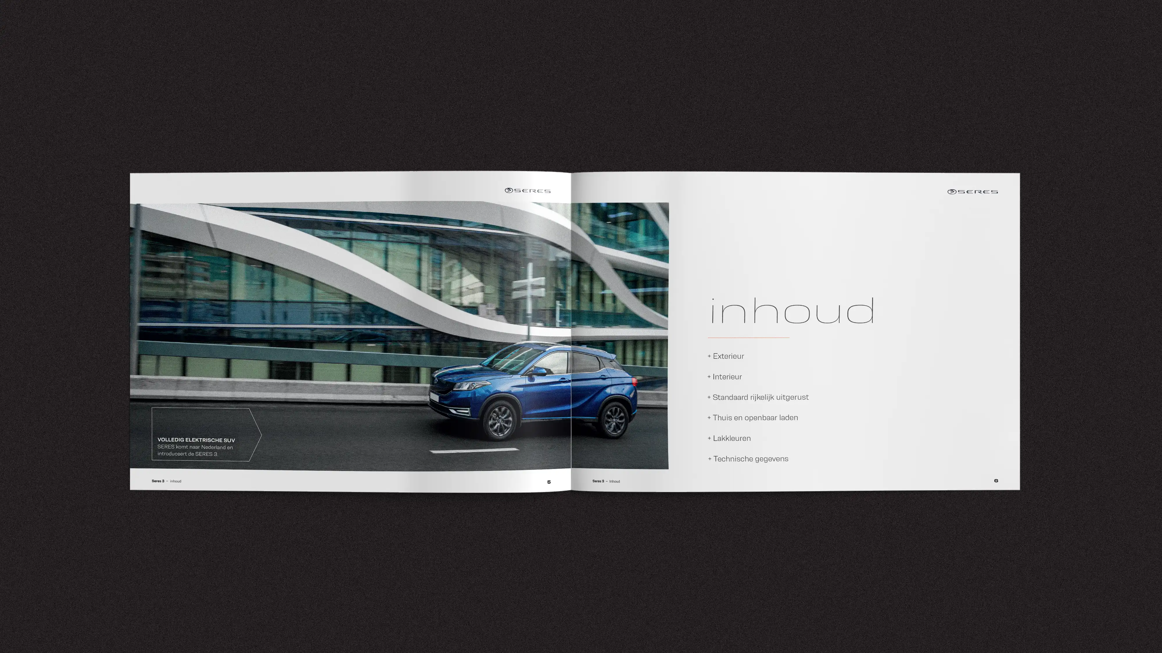
We began by defining the visual system. The typeface Resolve Sans, used in its Ultralight Wide and Bold Wd versions, became the voice of the brand: tech-driven, smart, and modern, without losing elegance or the premium feel. From there, we established the layout structure, colour palette, and a custom icon set. Every element was designed to be scalable, and consistent across both digital and print applications


Visual language & personality
The landing page was designed to be elegant and easy to navigate. The Typography leads, supported by large imagery and a clean grid that guides the reader through the content.
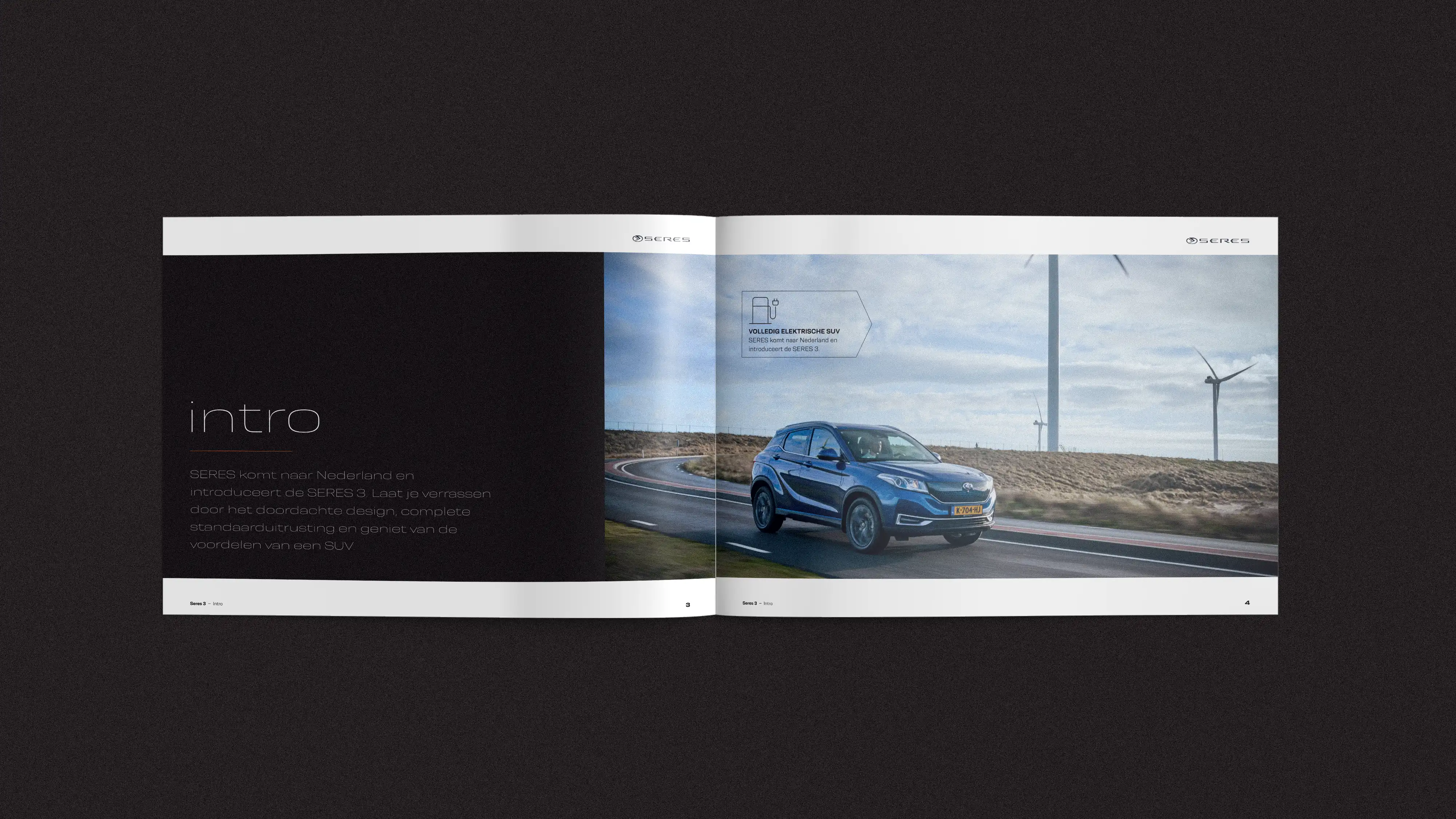
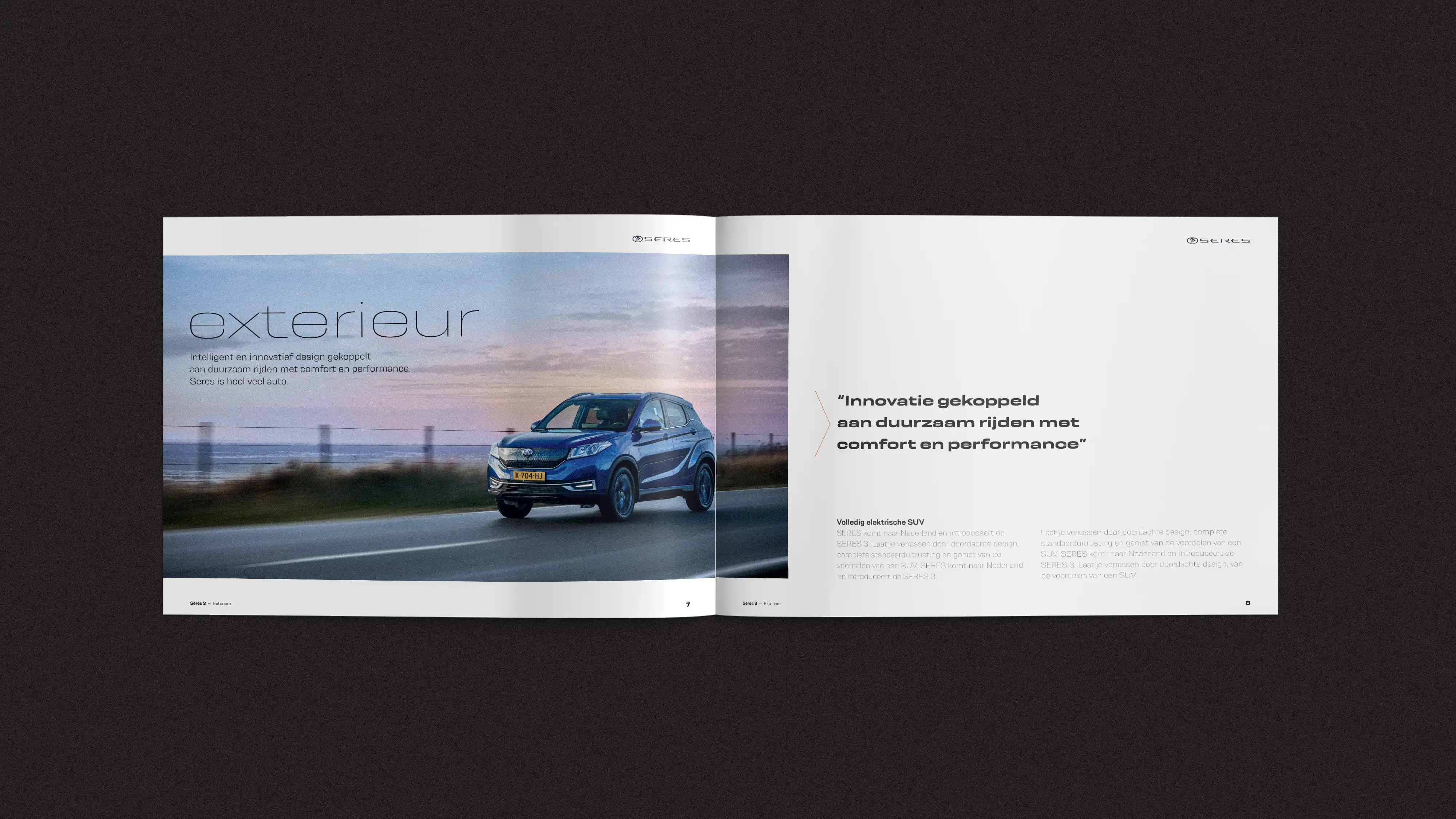
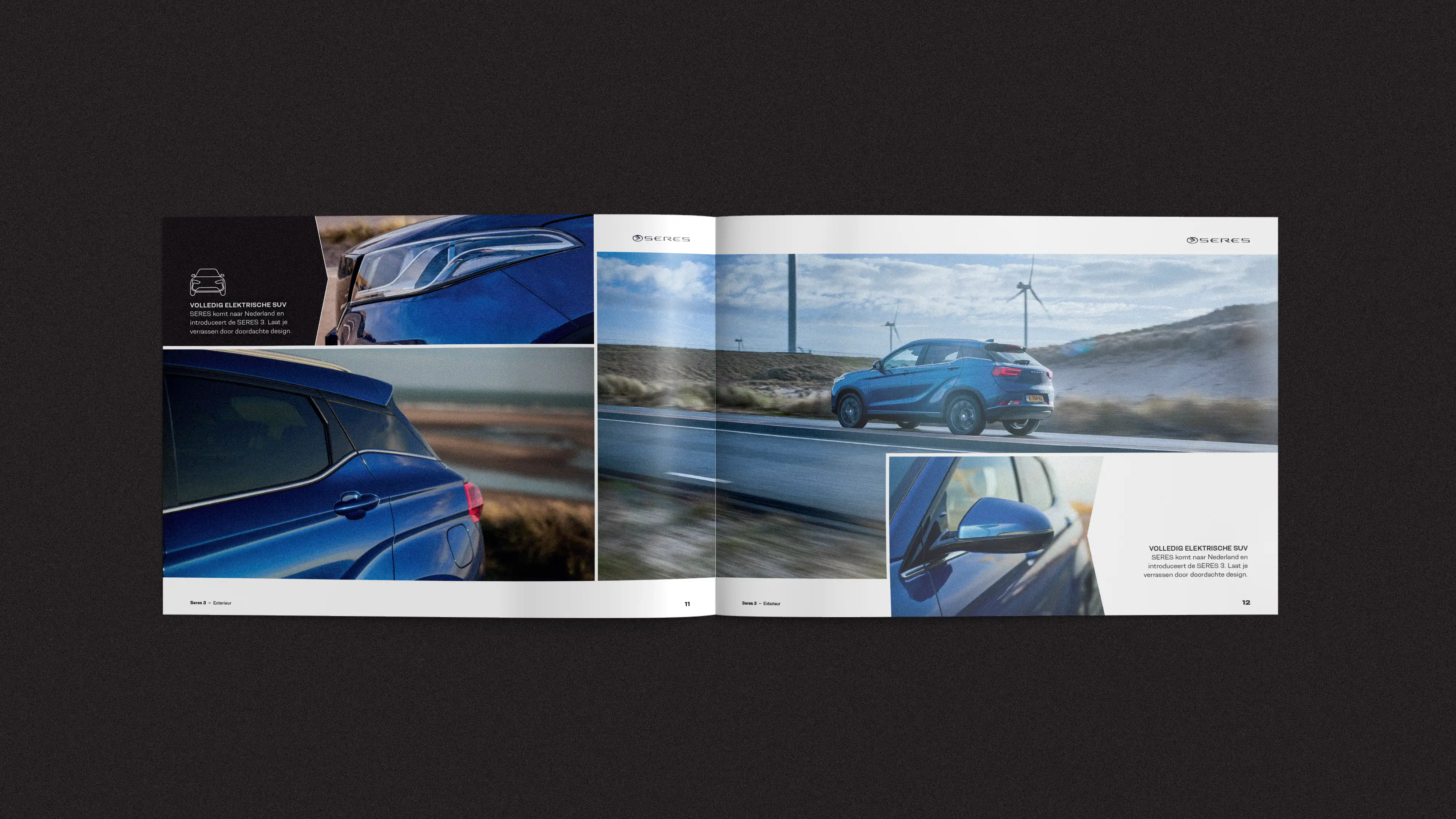
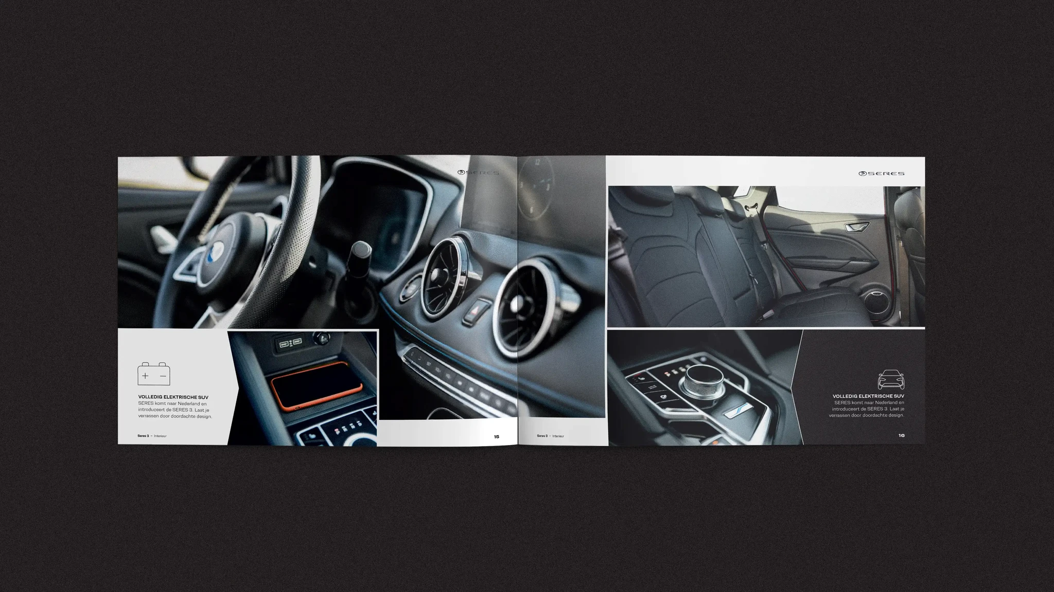
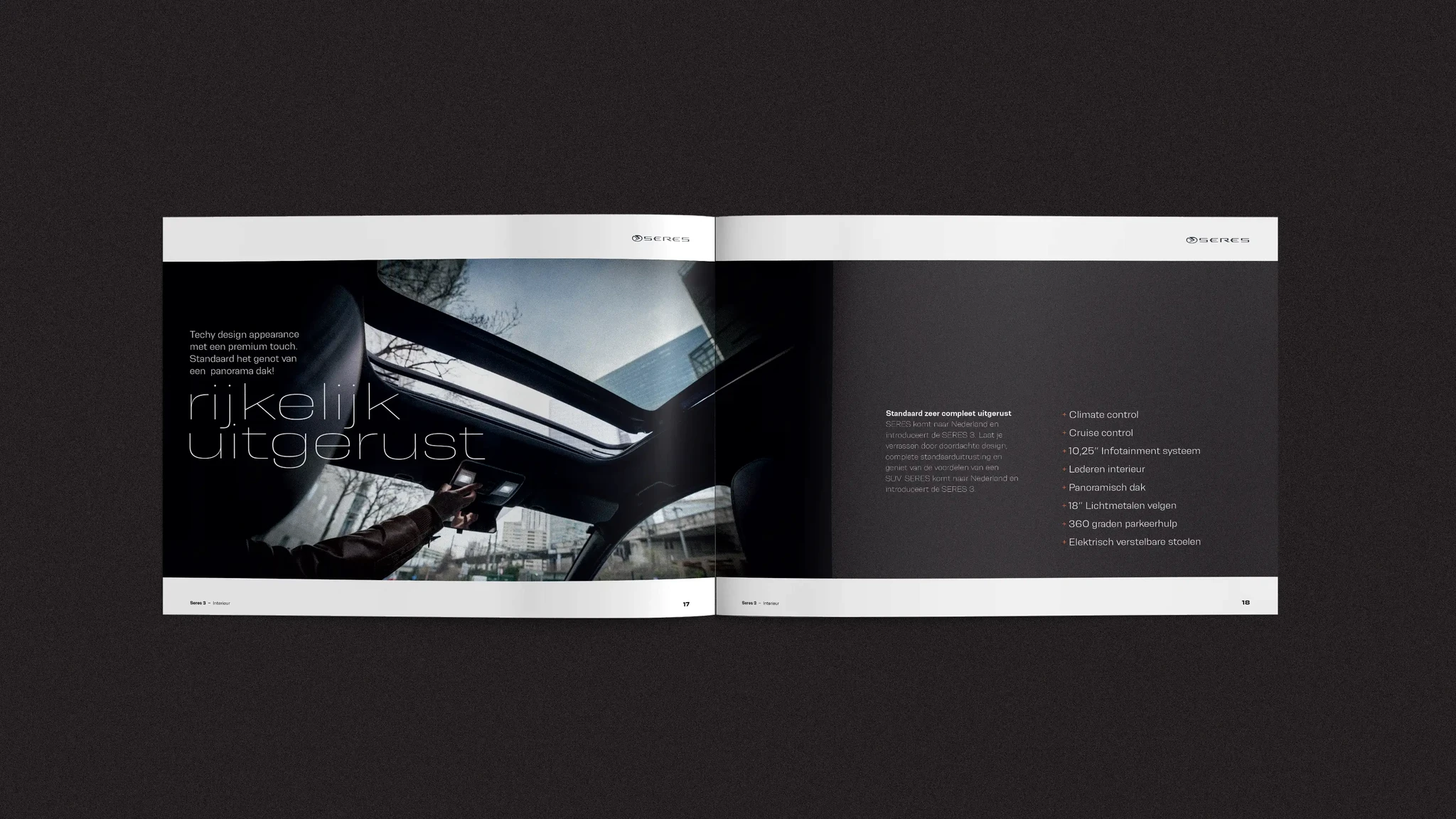
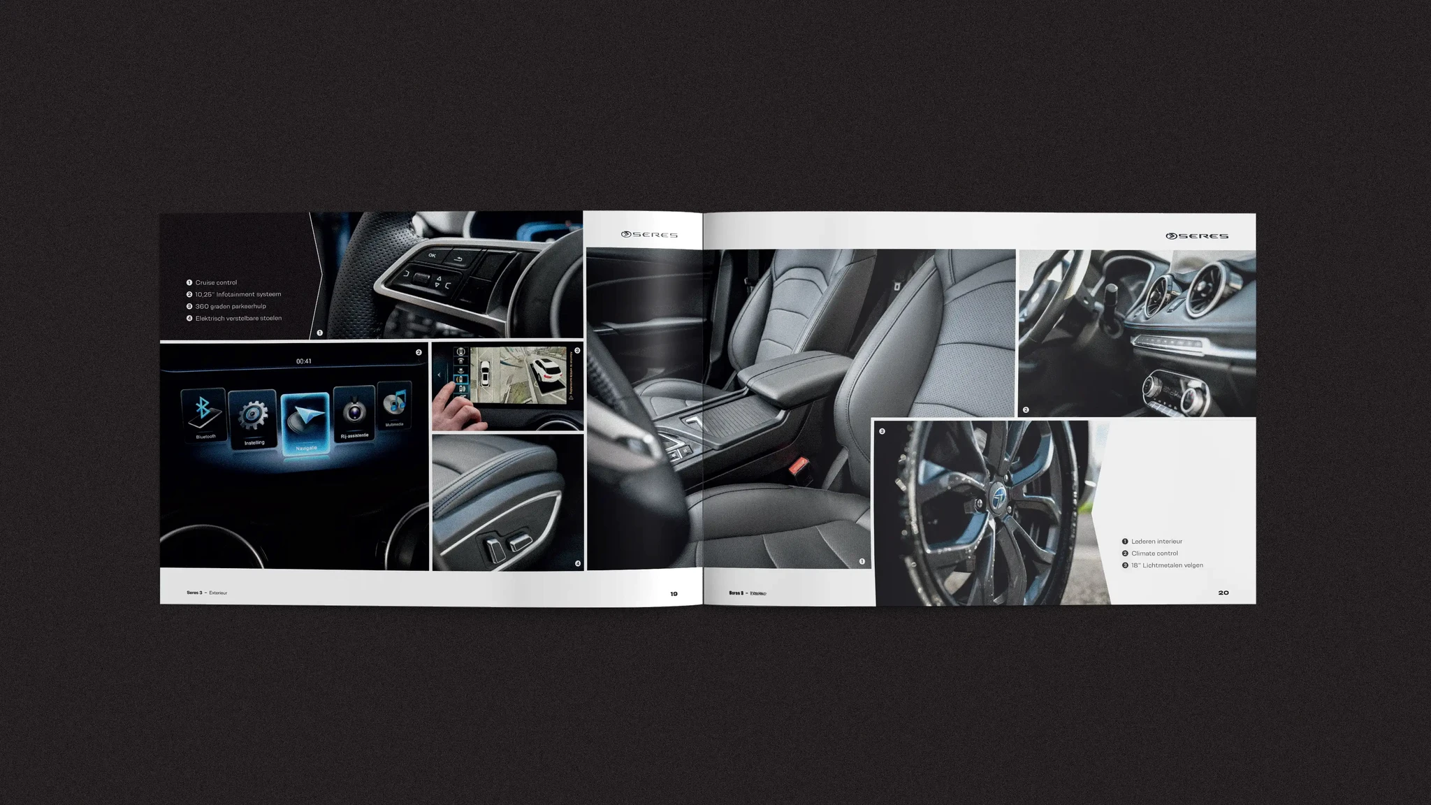
The brochure extends the same visual language, sharp contrasts, structured clarity, and a balance of light and dark layouts. For hero visuals and social assets, I experimented with blur and noise effects to build atmosphere and visual tension, reinforcing the modern, electric power of the Seres 3.


All Works


